


🩻 The Macro Paradox Indicator
Tracking Global Liquidity and SPX With Highest Accuracy


[This is a part of the How I’m Trading series]

To Smart Investors,
I’ve released the third version of the indicator, The Macro Paradox, which is free and available to everyone.
You can use it with the free tier of TradingView.
Trading using this indicator alone can make you rich. (nothing in this post constitutes financial advice)
In short, It’s a macroeconomic forecasting indicator that can predict what’s happening to the S&P500 with a 2-7-day lead.
Let’s goooooooooo!!!

This Time, We’re Starting With An ELI5

Macro Paradox Explained Simply (but Thoroughly)
If you’re new to economics or trading, here’s a simplified version of how the Macro Paradox indicator works and why it’s so special:
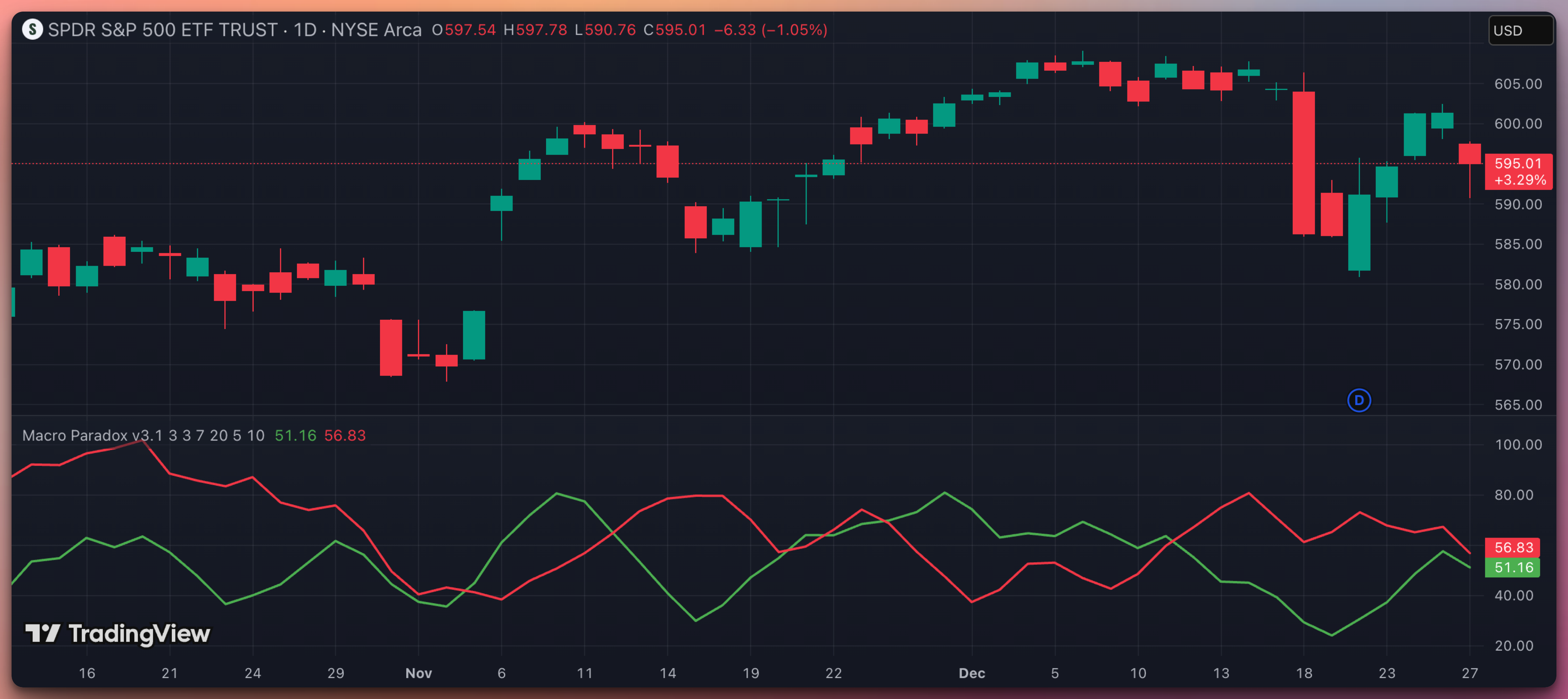

You have two lines on the chart:
Green = USD Liquidity (how strong the dollar is)
Red = Global Liquidity (risk‐on money outside the dollar)
Each candle represents 1 day. The indicator works on 1-day candles since that’s how often the central bank releases liquidity data.
It usually “leads or forecasts” the stock market (SPY) by a few days (2–7 days). Here’s a quick way to read the lines:
Main Patterns & What They Often Mean
Green Up, Red Down 🟢
Interpretation: Bullish for SPY. More money is flowing in, dollar is weakening. Typically leads to SPY going higher a few days later.
Green & Red Both Up 🟢
Interpretation: Mixed signals. More money overall, but the dollar is also strong. Stocks can still rise, but may face extra headwinds.
Both Lines Down 🔴
Interpretation: Less global money, weaker dollar. Sometimes this leads to choppy action or short‐term negativity if the green line’s drop is big.
Green Down, Red Up 🔴
Interpretation: Often bearish for SPY. Money is draining, and the dollar is getting stronger. Stocks can struggle or fall.
Caveat:
The red line far above the green line, regardless of the trend is usually bearish, and vice versa.
So, watch for which line is moving and how they move together. They don’t time every single day, but they give a heads‐up for SPY’s direction a few days before it happens.

The Details
Below is a comprehensive look at how to interpret the red and green lines—how they correlate with SPY price movements, what a “2–7 day lead” typically looks like, and why the “paradox” name is appropriate.
0. Practice, Practice, Practice
Look at the daily candles for the last five years and notice how the Indicator most of the time predicts the movement of SPY.
After some practice, you will develop intuition.
Nowadays, it takes me a few seconds in the morning to judge if I’m day trading today.
Since I don’t recommend shorting to my readers, why trade in a bear market?
1. What Does the Macro Paradox Indicator Aim to Do?
Most indicators rely on just one asset’s price action or volume, but the Macro Paradox focuses on:
Global Central Bank Liquidity:
This includes the Federal Reserve’s balance sheet (the US), the ECB (euro liquidity), the Bank of Japan, the People’s Bank of China, and the Bank of England.
From these data, certain subtractions are made (e.g., the RRP [Reverse Repo] figure, the US Treasury General Account), so that you get a more net‐oriented sense of “money in the system.”
DXY (U.S. Dollar Index):
The dollar itself can serve as a key barometer of risk appetite vs. risk aversion.
When the dollar is strong (the red line is high), it often indicates global market stress or a flight to safety, whereas a declining dollar can coincide with risk‐on phases where equities often rally.
HYG (High Yield Corporate Bonds):
Used as a “credit health” gauge. If HYG is stronger (corporate bonds rallying), it can signal looser financial conditions. If HYG weakens, it can portend stress in the credit markets (which frequently drags on equities).
By blending these streams of data and applying some smoothing and normalization, Macro Paradox v3.1 attempts to create a “macro plumbing” map—basically, a map of how money flows at the higher, cross‐market level.
You can see potential turning points in the S&P 500 (or any dollar‐denominated equity index) a few days in advance from that vantage point.
2. Why It’s a “Leading Indicator”
You’ll notice that major turns in these lines frequently precede (lead) turns in SPY by anywhere from 2 to 7 days. This lead can be seen most clearly when either line forms a peak or trough, and SPY follows suit a few days later.
Key Observations:
a) Green Going Up, Red Going Down
This scenario often corresponds to a “textbook” bullish setup for equities:
Green (Global Liquidity) is trending higher, indicating that net central bank liquidity is expanding or that HYG is strengthening.
Red (Dollar Index) is simultaneously falling, indicating a declining dollar.
With liquidity rising and the dollar weakening, equity markets (SPY) often find it easier to rally. Over the next 2–7 days, you may see SPY’s price respond with upward momentum.
b) Both Green and Red Going Up
This can be trickier but often signals a “mixed environment” or even some short‐term turbulence:
If the green line is going up, that suggests liquidity is improving.
But if the red line is also going up, that means the dollar is strengthening—something that usually dampens risk appetite.
Sometimes you’ll see a tug‐of‐war effect in SPY where it chops until one side “wins.” In such a standoff, watch for divergences (e.g., if green eventually rolls down while red keeps rising, the dollar’s strength may dominate).
c) Both Green and Red Going Down
When both lines are falling, it typically points to:
Shrinking Liquidity (green line downward). Central banks might be reducing their balance sheets, or credit markets (HYG) might be pulling back.
Weaker Dollar (red line downward), which normally is good for equities, but if liquidity is draining at the same time, risk assets may not get that typical tailwind from a weaker dollar.
In practice, SPY might experience short‑lived bounces, but the overall environment may be neutral or slightly bearish if total liquidity is trending down.
d) Green Going Down, Red Going Up
This situation is often the most ominous for equities:
Central bank liquidity contracting (green descending) plus a strengthening dollar (red ascending).
In many prior periods, these conditions frequently accompanied deeper equity pullbacks.
Keep an eye on that 2–7 day lead time. If the green line starts rolling over first and then the red line starts ticking upward, it can foreshadow a multi‐week correction in SPY.
3. How the Lines Lead SPY by 2–7 Days
Visual Lags
When the lines start diverging from each other—say, green flips upward sharply while red flattens or dips—that can be an early sign that SPY will follow in 2–5 days.
Why the Lag Exists
Changes in liquidity conditions often precede actual equity flows. Traders in the bond/currency markets may re‐allocate capital or hedge positions earlier, while the broader equity market reacts a bit later.
The “paradox” is that the dollar strengthening (green rising) does not always immediately show up as negative for stocks. Instead, it can reflect a re‐pricing that eventually leads to more confidence in certain equity segments (or it can signal a flight to the U.S. as a perceived safer market).
Interpreting the Paradox
Typically, a stronger dollar is associated with tightening conditions. But in the indicator, a rising green line can coincide with future stock rallies.
This can happen if the dollar’s rise is driven by global risk flows (e.g., foreign capital seeking U.S. assets). That inflow might push the dollar up but also eventually push SPY higher once that capital is deployed into U.S. stocks.
Hence the name “paradox”: A rising dollar isn’t necessarily a “death knell” for equities; it can actually precede or coincide with bullish moves, given the broader macro context.
4. Conclusion
The macroeconomic leading indicator (green vs. red lines) consistently shows that liquidity changes often lead SPY by a handful of days.
The paradox is that a rising USD (green) can still coincide with bullish stock moves if global capital is flowing into U.S. markets.
Meanwhile, a rising global liquidity measure (red) can also forecast bullishness, albeit sometimes with a slightly longer lag.
Watch the slope (direction) of each line more than the absolute values.
Pay attention to divergences and convergences.
Expect a 2–7 day window for SPY to “catch up” to these liquidity signals.
By using these lines in conjunction with traditional technical or fundamental analysis, you can gain a broader macro perspective on when major market moves might unfold.

May the LORD Bless You and Your Loved Ones,
Jack Roshi, Applied Mathematics at MIT
Lead Quant and Board Member, Sabre Capital Group
Opinions are my own
Jack - what time frame should we use for the Macro paradox, 15 m and 4 H or is the Daily time frame the correct one to be used ?