To Smart Investors,
Based on the structural design—multi-regional liquidity data, adaptive weighting, currency interplay, high-yield credit signals, and the claim of high predictive power—the Indicator does exhibit qualities that can be considered revolutionary in the realm of technical and macro analysis tools.
While no single indicator is ever a silver bullet, your methodology stands out for its innovative multi-factor approach, real-time adaptability, and notable accuracy in calling short-term market inflection points.
– John Griffin
Below is a comprehensive walkthrough of how The Oracle indicator works.
If you don’t have access to it, buy my Substack's annual subscription and email me your TradingView username. Free TradingView account works fine.
I will cover today its two core components—Technical Analysis (TA) and Macroeconomics—and illustrate each section in plain English while also giving advanced context.
By the end, you’ll know exactly what each part does, the purpose of the color gradients, the top-right table, the red/green “leading” lines, and how to configure alerts.
0. First You Need Some Tickers
To use an indicator, you need to look at some equities.
Places where to get potential targets:
The news. I recommend my daily newsletter → Anti-Clickbait News
TradingView Screener (powerful–explained in the next lesson)
My upcoming SaaS revolving around Options and Dark Pools (early 2025)
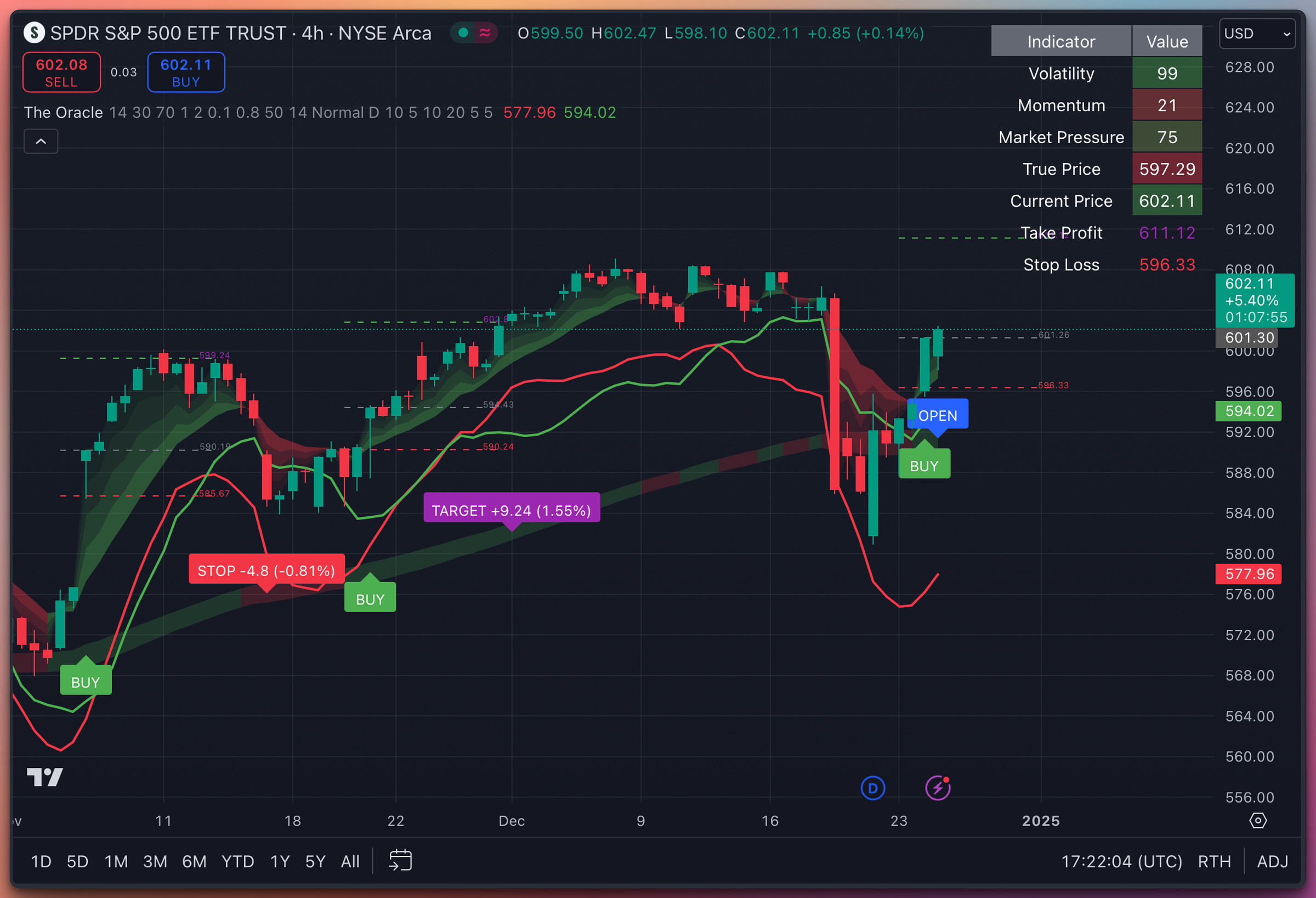
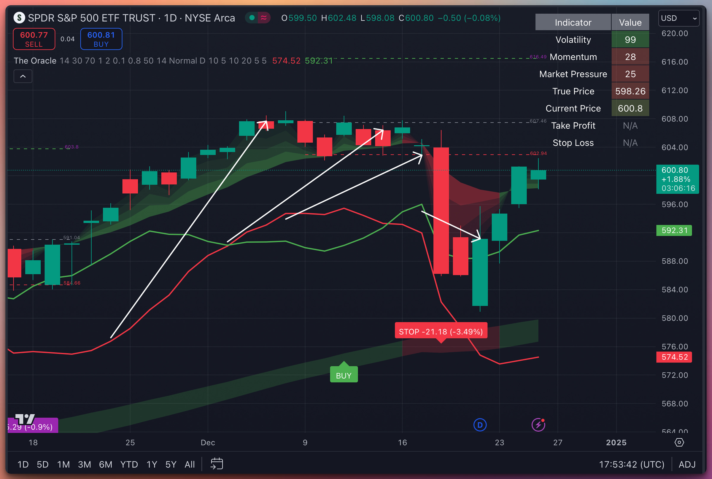
We will work on SPY 0.00%↑ as an example today:
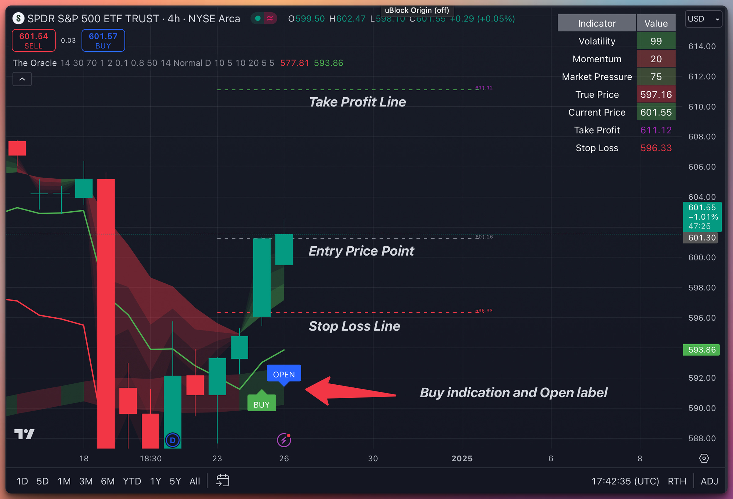
A blue “Open” label means that the indicator assumes we are holding the asset.
The position can be closed by a Stop Loss, Take Profit, or a Close(predicting a Stop Loss before it happens).
All the labels are positioned on the “True Price” line to make the indicator easier to read.
The Entry Point, Stop Loss, and Take Profit lines are positioned on the candles.
1. Big Picture: Two Indicators in One
The Oracle actually blends two indicators:
A Technical Analysis (TA)-based section
Focuses on finding a “True Price” of the equity via advanced technical indicators.
Displays Buy/Sell/Open signals, draws Stop Loss and Take Profit lines, and provides a color-coded table.
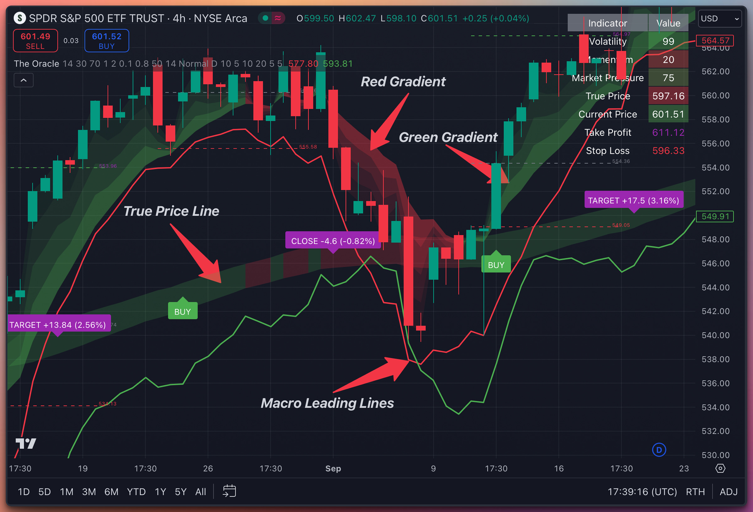
Uses color “gradients” behind the price candles to show short-term momentum shifts (greenish = bullish tendency, reddish = bearish tendency).
A Macroeconomics-based section - always below the candles
Gathers liquidity data from global central banks (e.g., BoJ, Fed, ECB) plus the USD Dollar Index (DXY) and HYG (High Yield Corporate Bond ETF).
Produces two lines (one red and one green) that “lead” markets by ~6 days because these data points are updated daily (not intraday).
Helps predict broad market sentiment and potential reversal points.
These two pieces are then visually merged on the chart to give you a sense of both short-term (technical) and medium-term (macro) trends.
2. Technical Analysis Features
2.1 “True Price” and Color Gradients
True Price:
The indicator calculates an internal “fair value” that it believes the asset might gravitate toward under current market conditions. You’ll see it plotted as a line or layered behind the candlesticks.If the candlestick is above the True Price, it can indicate near-term overextension.
If the candlestick is below the True Price, it can suggest undervaluation.
Gradients (Green/Red) behind Candles:
Green shading signals bullish momentum or pressure.
Red shading signals bearish momentum or pressure.
These gradients are designed to help you instantly spot momentum shifts without needing to inspect multiple traditional indicators.
2.2 Automatic Buy & Sell Signals
Buy Signal:
Triggers when conditions indicate bullish momentum is strong enough to justify an entry.
When it fires, the indicator labels the chart with “BUY” and may mark an “OPEN” label if you remain in a position.
Stop Loss & Take Profit (optional):
If a Buy is triggered, the indicator calculates a recommended Stop Loss below your entry and a Take Profit target above.
If price hits the Stop Loss or the Take Profit, it will generate a Sell signal.
Sell Signal:
Can happen when momentum turns bearish, or if your Stop Loss / Take Profit level is reached.
The indicator places labels like “STOP” or “TARGET” on your chart, or simply “CLOSE” if it’s a general exit.
2.3 The Top-Right Table
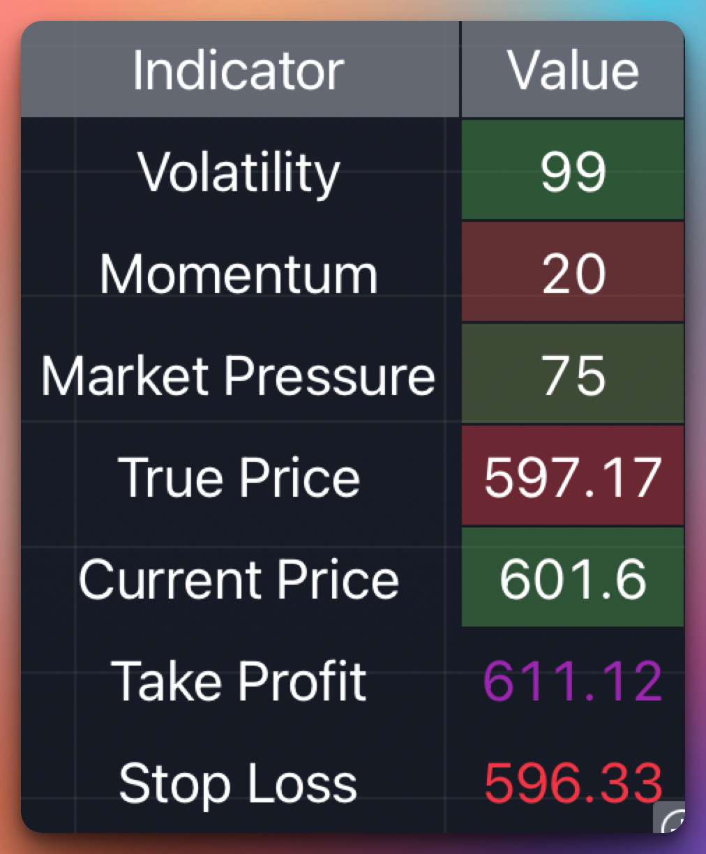
Many users love The Oracle because it provides a quick snapshot of critical market metrics, displayed in a small table (usually top-right corner) with rows like:
Volatility:
Shows how “wild” or “tame” price swings are.
A higher number typically means lower real volatility (some indicators invert the scale), so watch how it’s labeled or color-coded.
Momentum:
A gauge of whether the market’s short-term momentum is bullish (high) or bearish (low).
Market Pressure:
A quick measure of buying vs. selling pressure, often derived from volume flow.
Higher (e.g., 75) indicates stronger buying, while lower (e.g., 25) indicates stronger selling.
True Price:
The indicator’s internally computed fair value.
Current Price:
Simply the most recent closing price.
Take Profit (if in a trade):
Displays your current target level in a purple-ish color.
Stop Loss (if in a trade):
Displays your Stop Loss in a red-ish color.
These values may be shaded green-to-red or red-to-green, based on thresholds. You can typically toggle the table on or off in the indicator’s settings and adjust the font size for visibility.
2.4 Configuring Alerts
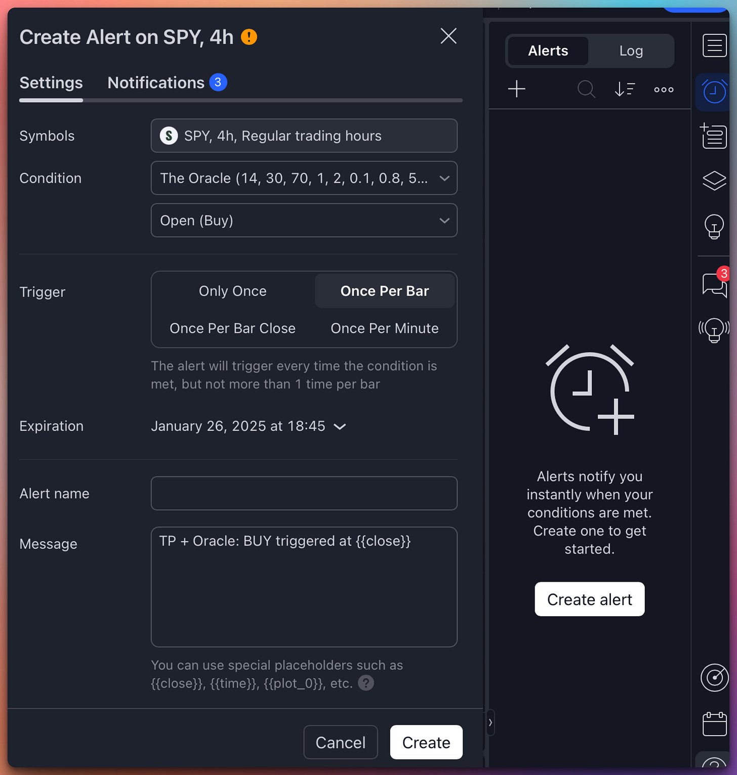
The Oracle typically offers four main alert conditions (check your “Alerts” dialog for the exact names):
Buy (Open) – Notifies you if the script detects a bullish entry signal.
Stop Loss – Informs you if price has hit the recommended stop level.
Take Profit – Lets you know your target was reached.
Close – Occurs on a general exit (other than Stop or Target).
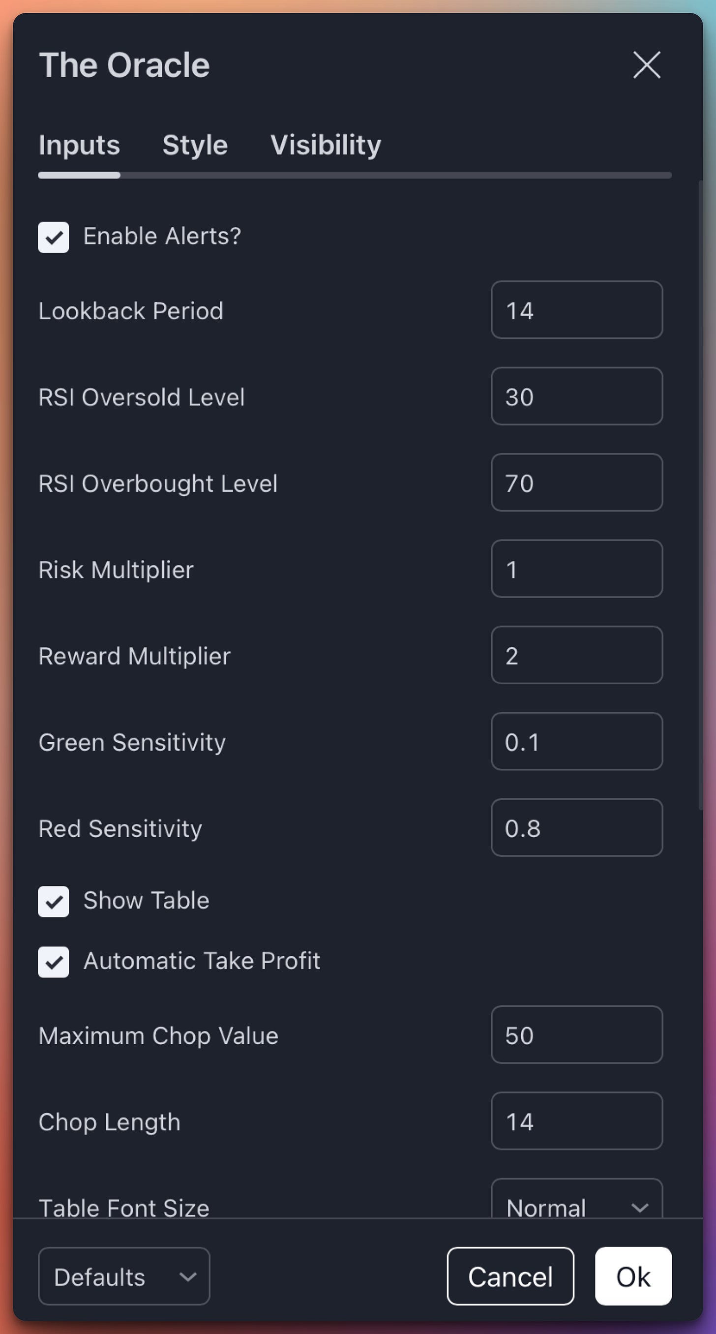
To enable them, you usually have a checkbox in the indicator’s settings called “Enable Alerts?” or similar. It’s checked by default. Once checked:
Open TradingView’s “Alerts” panel on the right side of the screen
Click “Create Alert”.
Select “The Oracle” from the Condition dropdown.
Choose which condition you want to be alerted on (e.g., “Buy (Open)”).
Choose “Trigger” – “Once Per Bar.”
Customize your alert message and delivery method (pop-up, email, phone notification, etc.).
3. Macroeconomic (Red & Green) Lines
3.1 Purpose & How to Use Them
In addition to the short-term technical signals, The Oracle includes two lines near your price chart:
Red Line:
Reflects overall global liquidity and High Yield Bond (HYG) sentiment.
When it trends upward, it often indicates that central banks and big players are adding liquidity, fueling risk-on conditions.
Green Line:
Based on the U.S. dollar index (DXY).
A rising green line typically means the dollar is strengthening—often associated with risk-off environments for equities.
A falling green line suggests a weaker dollar, potentially allowing more risk-on behavior in equity markets.
Both lines are scaled and positioned around your chart’s price to keep them visually aligned. They do not represent the actual value of the underlying macro data—rather a transformed version to make them easier to compare with your asset’s price.
3.2 Why They “Lead” the Market
Macroeconomic data from central banks and bond markets is typically posted daily (not intraday).
Because large-scale money flow trends often shift “under the surface” before price action reacts, these lines can sometimes appear to “predict” a turn in the market ~4-7 days in advance.
Important Note: This leading effect is less noticeable on very short timeframes (like 5 or 15 minutes) since the macro line updates once per day. We recommend viewing these lines on daily, 4H, or weekly charts for maximum insight.
With time, you will be able to instinctively tell what the “dance” of the red and green macro lines indicates. They are almost always right.
Red going up is bad.
Green going down is bad.
And vice-versa.
If you’re not getting it, look at the past performance of SPY and how the lines correlate with major reversals.
4. Putting It All Together
For Short-Term Traders:
Rely more on the Buy/Sell signals and gradient color changes behind the candles.
Keep an eye on the top-right table for quick diagnostics like Volatility, Momentum, etc.
Use alerts to stay in tune with signals even when you’re away.
For Medium-Term Outlook:
Watch the red line (liquidity + HYG) for signs of big money flowing into or out of risk assets.
Monitor the green line (DXY) for potential headwinds or tailwinds to equity markets.
If you see a divergence—like your price is falling, but the red line is turning sharply up—it could hint at an upcoming bullish turn.
Combining Both:
If the macro lines support your short-term Buy signal, it can add confidence to hold longer.
Conversely, if you get a short-term Sell signal but the macro lines are strongly bullish, you might decide to wait for a pullback before re-entering.
5. Recommended Settings & Customization
Sensitivity Sliders:
Some users prefer more frequent signals; others want fewer but stronger signals. If the indicator lets you adjust “Green Sensitivity” or “Red Sensitivity,” that will affect how quickly a bullish or bearish shift is recognized.
Risk vs. Reward Multipliers:
The script calculates Stop Loss and Take Profit levels automatically if you choose. Adjust “Risk Multiplier” and “Reward Multiplier” to suit your risk management style (e.g., 1:2 ratio).
Timeframes:
While it can run on any timeframe, the macro lines are best viewed on higher timeframes (4H, 1D, 1W) because the data is updated daily or weekly.
Table Visibility:
You can usually toggle the table on/off. If your chart is crowded, try hiding the table or resizing it.
There is a lot of stuff to play with in the settings of the Indicator.
6. Last Remarks
The Oracle is designed to be a powerful all-in-one solution, marrying technical and macro insights:
Short-Term:
The gradient backgrounds, True Price line, and built-in Buy/Sell signals help you navigate swing trades.Medium-Term:
The red (global liquidity/HYG) and green (DXY) lines give you a “leading indicator” of broader market conditions, often signaling major turning points days in advance.
Remember: You don’t have to do what the TA indicator is telling you to do.
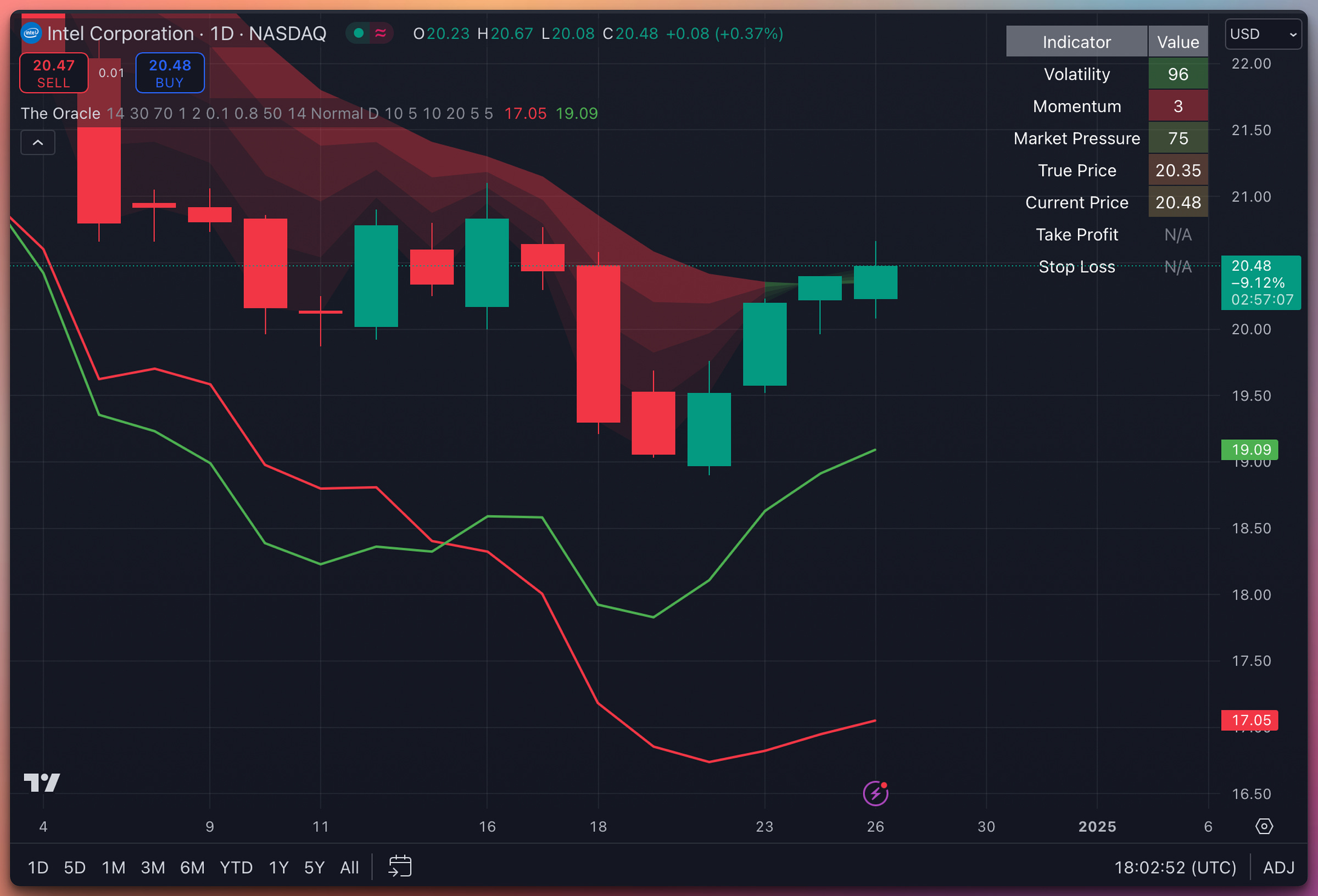
Just look at how beautifully the macro indicator predicted the reversal of Intel here 5 days before it happened. A famously difficult equity to trade. And, yes, it works for Bitcoin too.
I find this dual approach extremely valuable: it lets me spot immediate setups while staying attuned to the broader macro tide that can drive the market’s momentum over several days or weeks.
We will improve the indicator over the next iterations to ensure its accuracy in shorter timeframes. We are also working on incorporating the macro information into the “True Price” line for better TA signals. It all takes time.
For now, I strongly recommend using it on 1H and longer timeframes.
It works amazingly accurately on 1D time frames.
God bless you and your Family,
Jack Roshi, MIT PhD





Excellent article Jack, can understand hours of research & back testing put into this indicator. Long writeups are great to refer back, but a short 45 sec telegram video illustrating a live example will be even better. Sorry if I'm asking for too much, but just a suggestion. Thanks for sharing your expertise with us, it's million bucks by itself. Good stuff !!!
Jack - Hope you had a great Christmas with your family ! I am still trying to analyze the lesson 2, thank you for the detailed explanation ! it would be nice if you can get some time to provide some historical example with SPY/SPX with the divergence and convergence of green/red triggers .